GR User Forum
You are using an out of date browser. It may not display this or other websites correctly.
You should upgrade or use an alternative browser.
You should upgrade or use an alternative browser.
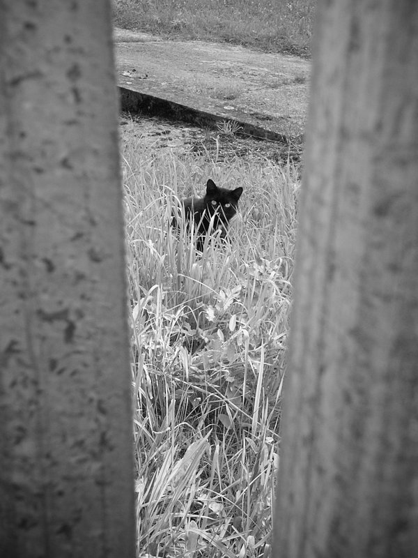
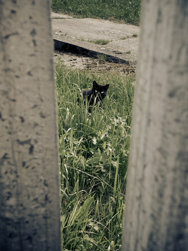
Kitty behind the fence
- Thread starter odklizec
- Start date
") Would be a nice print.
Would be a nice print. CHICHORNIO
New Member
Full Color!!! No doubt. Nice Shot. Do not frame the picture. Congratulations.
CHICHORNIO
New Member
Let the viewer find the cat! I still think you should keep it in color. A little more saturation on the green grass and the job is done. I love cats then I love the picture. Good shot!
thelps
Active Member
Pavel,
I think you have been tricky here and used some kind of "red" filter or green bias in the post process of the B/W image to make the grass look white?
I think I like the B/W one most, after all the cat has black fur and the white grass is a good contrast, it makes your eye focus on him/her.
- did you make this white grass choice when processing your image? :?
rui fernandes
New Member
Colour version for me. BW is very good, no doubt, but this colour range has something special/different. And that makes all the difference to me ;-)
I think the geometry and depth gains with colour too. BW makes it less vibrating (??)
I think the geometry and depth gains with colour too. BW makes it less vibrating (??)
odklizec
PK
CHICHORNIO, Orol, Tim and Rui...
Thanks for your comments guys! Funny thing how simple photo started a discussion? I agree with you guys, B&W is most probably better. Color version is my "usual" style but this time I prefer simplicity provided by desaturated colors.
Tim, this time I did not apply any special processing over B&W photo. It's just SP Monochrome2 filter and slightly edited contrast. What I like on B&W version is the infrared-like effect on grass.
CHICHORNIO
New Member
I don´t to give up! The picture you took is not that simple, and the discussion about b&w or color neither. I hope you all guys know William Eggleston pictures...anyway I´m copying you the link (http://www.egglestontrust.com) to refresh your memories about one of the most originals photographers of all times. (look forward for his 2009 show about PARIS in the Cartier Foundation).