GR User Forum
You are using an out of date browser. It may not display this or other websites correctly.
You should upgrade or use an alternative browser.
You should upgrade or use an alternative browser.
2nd February 2010
- Thread starter Wiener
- Start date
Wiener
Active Member
Thanks for your advice Gerd and Pavel.
It is much appreciated!")
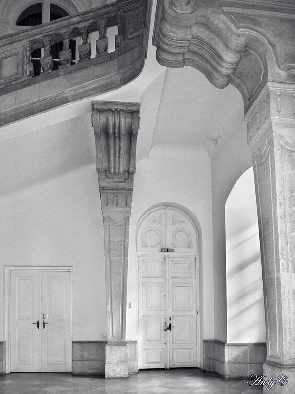
Normaly I am not inspired by Baroque architecture (which my more knowledgeable partner assures me it is) but this room really has something!
I agree that higher contrast would be desirable, but was concerned that the noise would take over if I increased the exposure any further. However, I have added more gama, increased the black level considerably and maximised the contrast... :?
It is much appreciated!
Normaly I am not inspired by Baroque architecture (which my more knowledgeable partner assures me it is) but this room really has something!
I agree that higher contrast would be desirable, but was concerned that the noise would take over if I increased the exposure any further. However, I have added more gama, increased the black level considerably and maximised the contrast... :?
Attachments
-
EXIFR0032249SP2s.jpg567.6 KB · Views: 280
waloszek
Member
After you praised Pavel's and my advice, I am somewhat reluctant to admit that I am not quite content with your result. When I compared all three versions, I must admit that I tend to like your first attempt better, because it is more like an "old-fashioned" low-key photo. Or, in other words: In your new version, the dark image portions are a little too dark to my taste. But I have to be careful with such judgments, because we cannot really trust our screens and color profiles...
Anyway, I liked the lighting in my own, nearly B&W version, and as someone opted for sepia, I tried to give this image a sepia-like look (whatever that means - I just selected a yellowish hue and desaturated the image a bit in "Farbe Anpassen" in PSE8/Mac. Moreover, I lowered gamma to 0,9 (as far as I remember...).
And below you will find my result!
Best regards, Gerd
Attachments
-
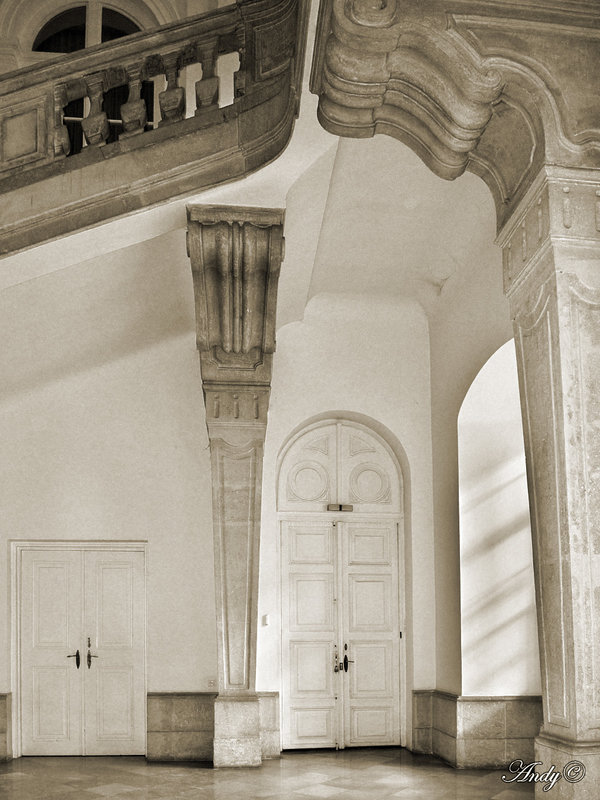 EXIFR0032249SP1s_afc2.jpg467.5 KB · Views: 224
Wiener
Active Member
Gerd,waloszek":i61d5lmb said:After you praised Pavel's and my advice...And below you will find my result!
Best regards, Gerd
I think I need to sleep on this! And thanks for making the time to explore the potential of my original image!
For me, it is also a mood thing and, perhaps, a daylight thing. I am sure that some images look very different when my desk here is lit by daylight than by lamp light...
I have a long way to go before I am really up to speed with this 'light room' stuff but it is great fun and certainly not boring to delve deeper into software development possibilities...
Cheers for now!
Andy