GR User Forum
You are using an out of date browser. It may not display this or other websites correctly.
You should upgrade or use an alternative browser.
You should upgrade or use an alternative browser.
Harbour End
- Thread starter Wiener
- Start date
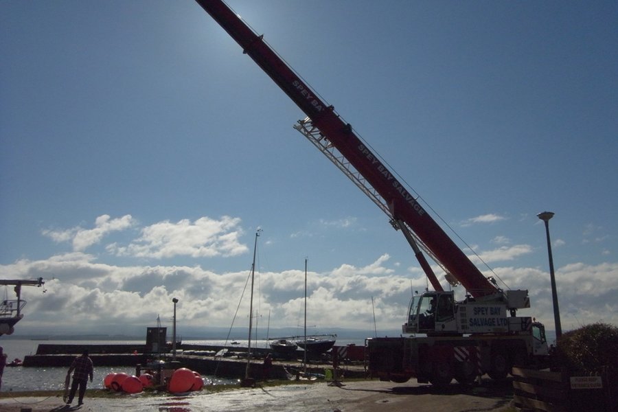
Blow-in
Active Member
Hi Andy,
I think I prefer the colour but it would look a bit better without the starter's box and dinghies in the right of the frame.
I was running around for most of the day but took these during my only coffee break. I didn't have time to capture the whole of the crane as I would have needed to be at the far end of the harbour. Little artistic merit, more a record of one lift.
Richard
Attachments
-
 EXIFbig beast.JPG294.6 KB · Views: 608
 -
 EXIFgoing down.JPG255.6 KB · Views: 610
 -
 EXIFgoing up.JPG215 KB · Views: 604
 -
 EXIFlanded.JPG275.2 KB · Views: 600
 -
 EXIFlift off.JPG233.6 KB · Views: 610
 -
 EXIFready to lift.JPG234.6 KB · Views: 606
 -
 EXIFSandy at work.JPG237.8 KB · Views: 609
 -
 EXIFslings on.JPG221.8 KB · Views: 610
Wiener
Active Member
Hi John,macfiend":38gdox7o said:Hi Andy,
I have to say I really like the black and white version best.
It seems to convey more emotion to the entire shot.
Nicely done
John
I really could not make up my mind. On the b&w though, the boat-shaped pier end seems to be heading out into open water and this seems to be more in harmony even if it makes no sense at all!
Andy
Wiener
Active Member
Thanks for your opinion, quester...quester":s67kttab said:There's a mood in the b&w, but there's life in the color!
Angle of shot in the b&w is more interesting, too...
Andy
Wiener
Active Member
Blow-in said:Hi Andy,
I think I prefer the colour but it would look a bit better without the starter's box and dinghies in the right of the frame.
I was running around for most of the day but took these during my only coffee break. I didn't have time to capture the whole of the crane as I would have needed to be at the far end of the harbour. Little artistic merit, more a record of one lift.
Richard
Hi Richard,
I did not linger long as I had too much to do, though the day was gorgeous!
The little flash of colour against the steely-blue water works good, though I too found the composition a little out of balance. The reason I made the other one b&w was because the small difference in perspective made the colour impossible to see on that one. Of course, once I master Photoshop, all things may yet be possible!
I like your px series a lot, though the contrast does seem a little low and the colours washed out. My crane shots lacked a little as well it has to be said! The light was quite tricky.
Andy
Wiener
Active Member
Thanks Jochen.JONIE":1b65lhpu said:Andy,
I like the coloured one more in this situation. I think it is because of the interesting sceen of white (snow & clouds) and the red spots.
And the "footprints" are more noticeable in comparison to the b&w.
Well done !
All the best,
Jochen
The footprints were what first caught my eye, so they are an important part of the story.
I also liked the snaking edge between the snow on concrete and snow on grass...don't know why it melted that way, but it seem like art somehow!
Andy
Wiener
Active Member
Peter,Orol":2cqyoogj said:Andy, as was already said by others, the composition of the B&W shot is much better balanced but the red on the life buoy plays an important role to my eyes, too. Thus, painting by red in Photoshop might be a valuable lesson.
Peter
I will report back...but probably not today!
Andy